MONEYBOX UK
Fintech App Rebrand
A fresh rebrand for UK's personal financial wealth app - Moneybox, alongside London creative agency, Ragged Edge. Collaboratively crafted a new brand identity for 1+ million customers and seamlessly launched across all product touchpoints.
PROBLEM
The fintech app faced an outdated brand identity that no longer reflected its growth or credibility. Its visual language lacked clarity and consistency across platforms, making it difficult to build trust with users. In a fast-evolving and competitive market, the company needed a modern, cohesive brand that conveyed reliability, innovation, and confidence.
OBJECTIVES
A fast-paced six-week project to overhaul the product’s brand — refreshing the visual identity, building a new design system, illustrating UI assets ensuring creative flare, and creating a clear, coherent Figma component library and guidelines for the organisation to use.
GOAL
The goal was to overhaul the brand, enhance visual UX and launch a refreshed app. We elevated visual trust to strengthen user confidence as one of the UK’s leading personal finance platforms.
ROLE
Lead Product Designer / UI
TEAM
Head of Product Design
Lead Product Design
Design System Specialist
Software Engineers x6
Ragged Edge
Ragged Edge provided the foundational brand concept, which we took forward through deep collaboration with in-house product designers and design director.
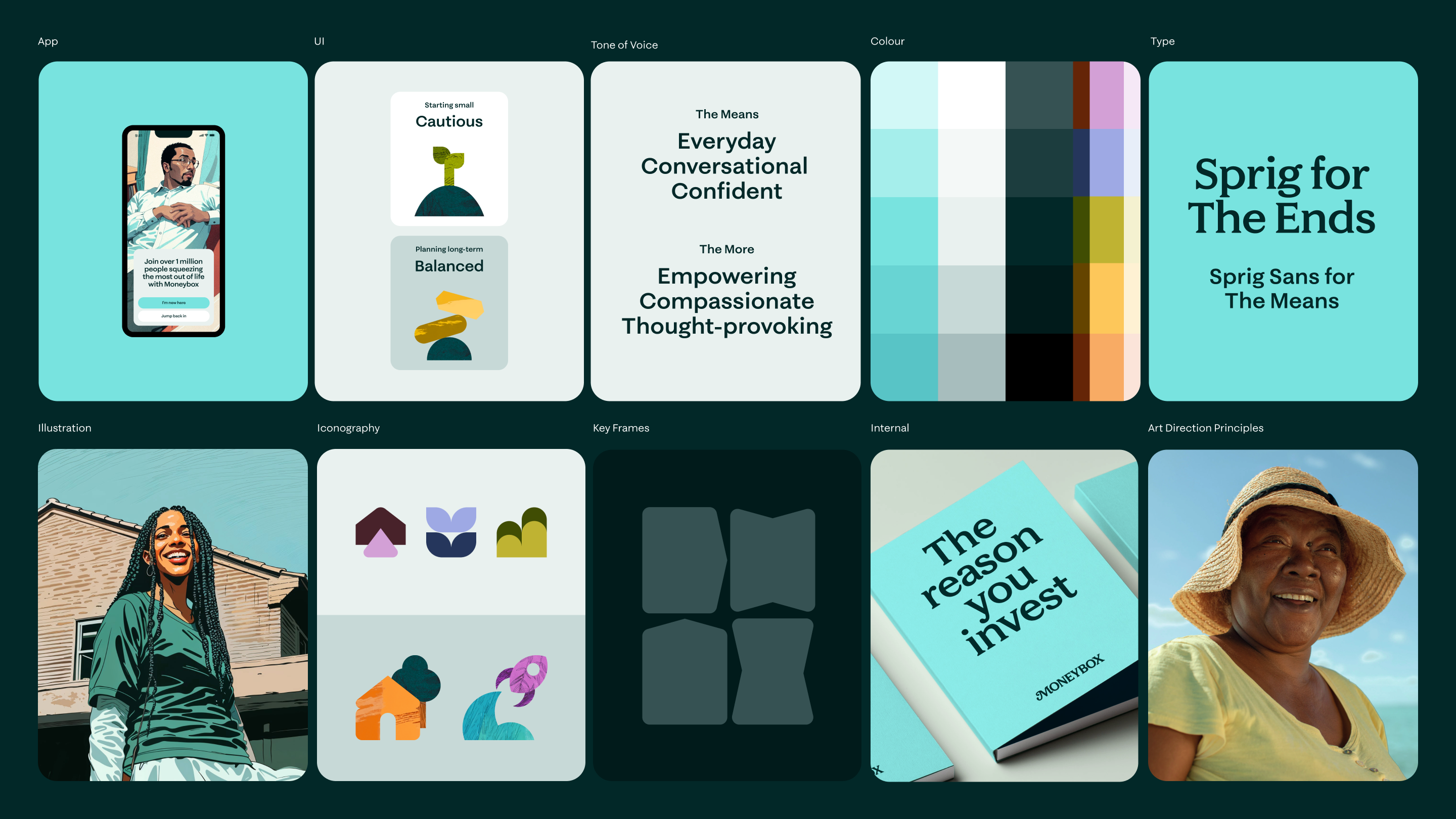
Ragged Edge Concepts
Moving away from the previous branding, the rebrand established a more mature, confident, and future-facing identity that communicates financial expertise, reliability, and innovation - differentiating the business in a highly competitive market.
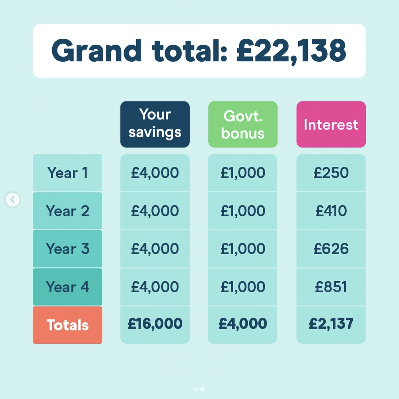
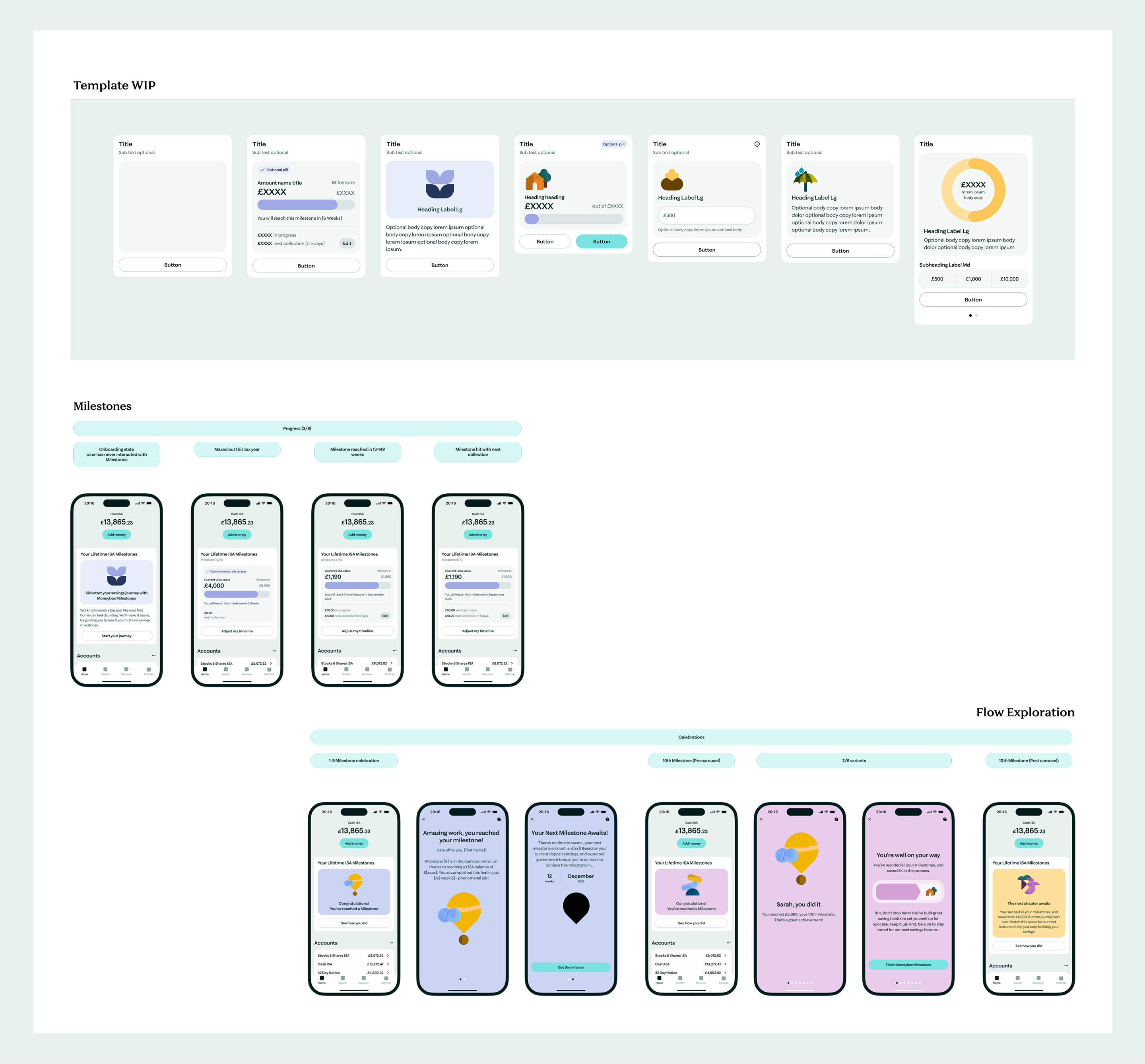
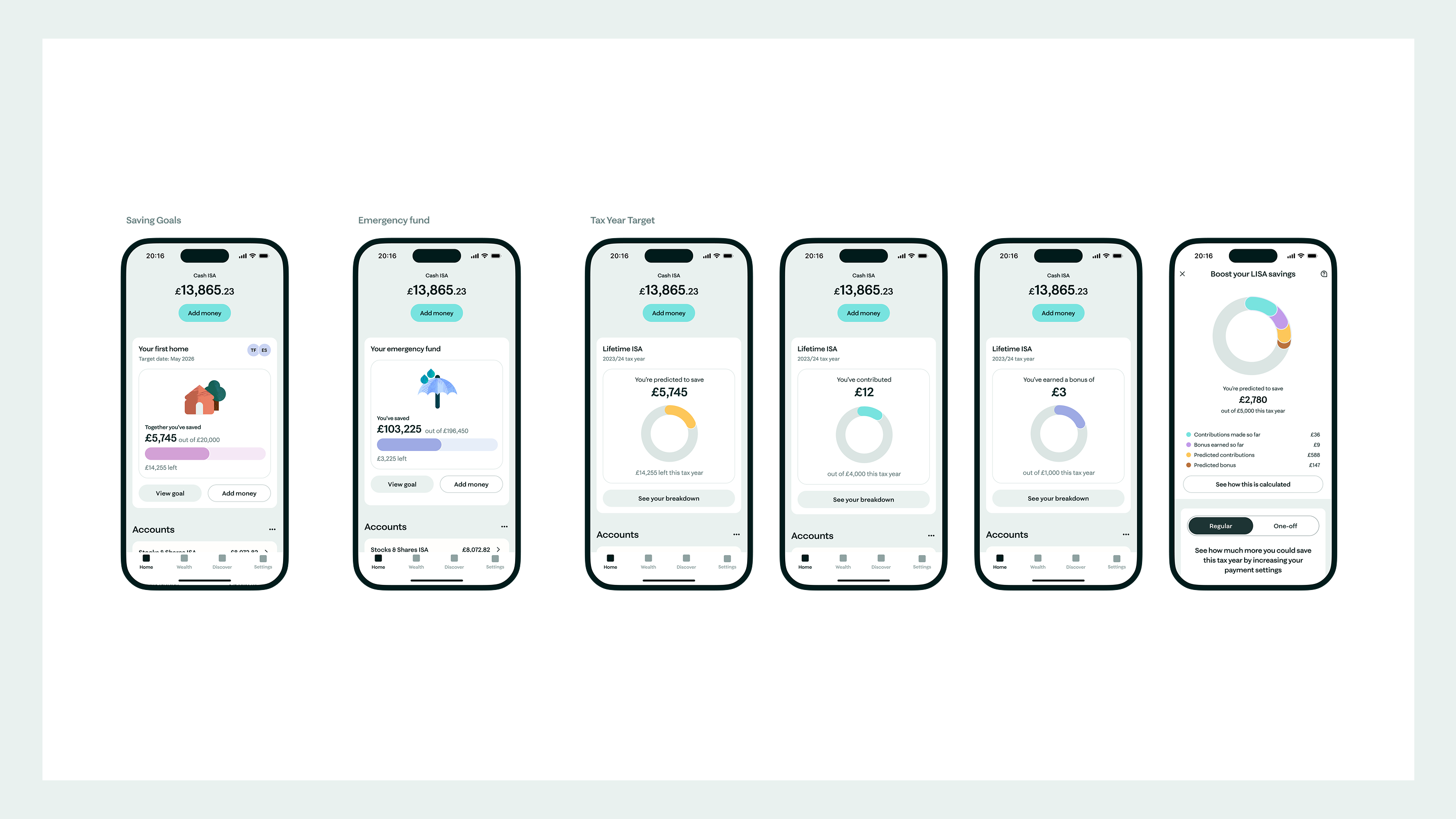
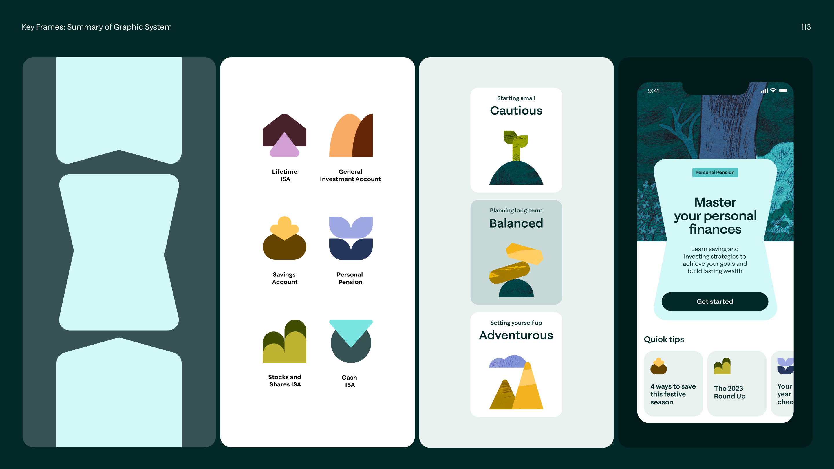
Whilst the agency established overall brand identity, we alongside established the UI identity for the app. The design process involved extensive exploration and iteration. With numerous design reviews, we refined visual direction, accessibility standards, data colour systems, and took the opportunity to reimagine the UX for financial data visualisations.
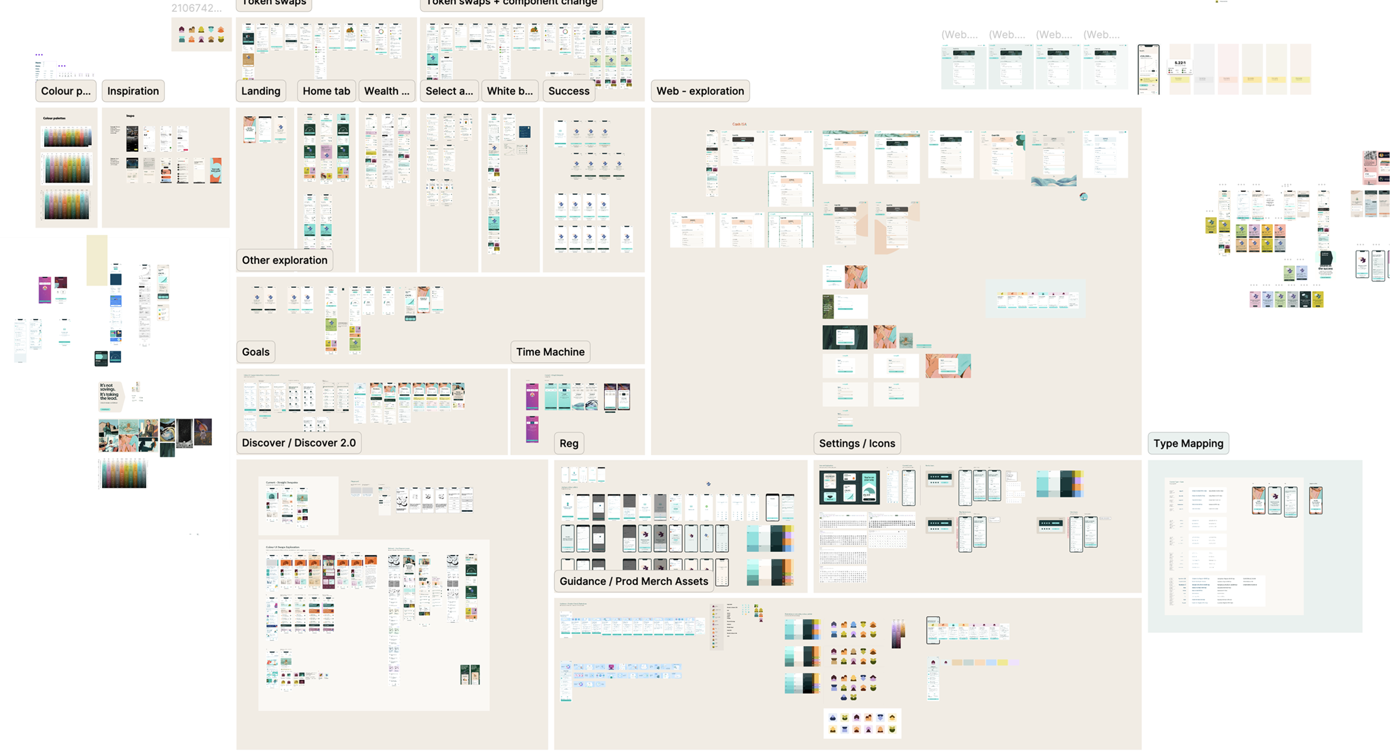
Creative exploration of different pages of the app, breaking down each module and building upon visual identity. A collaborative process with consistent communication was key.
A deeper dive into the creative iterations explored.
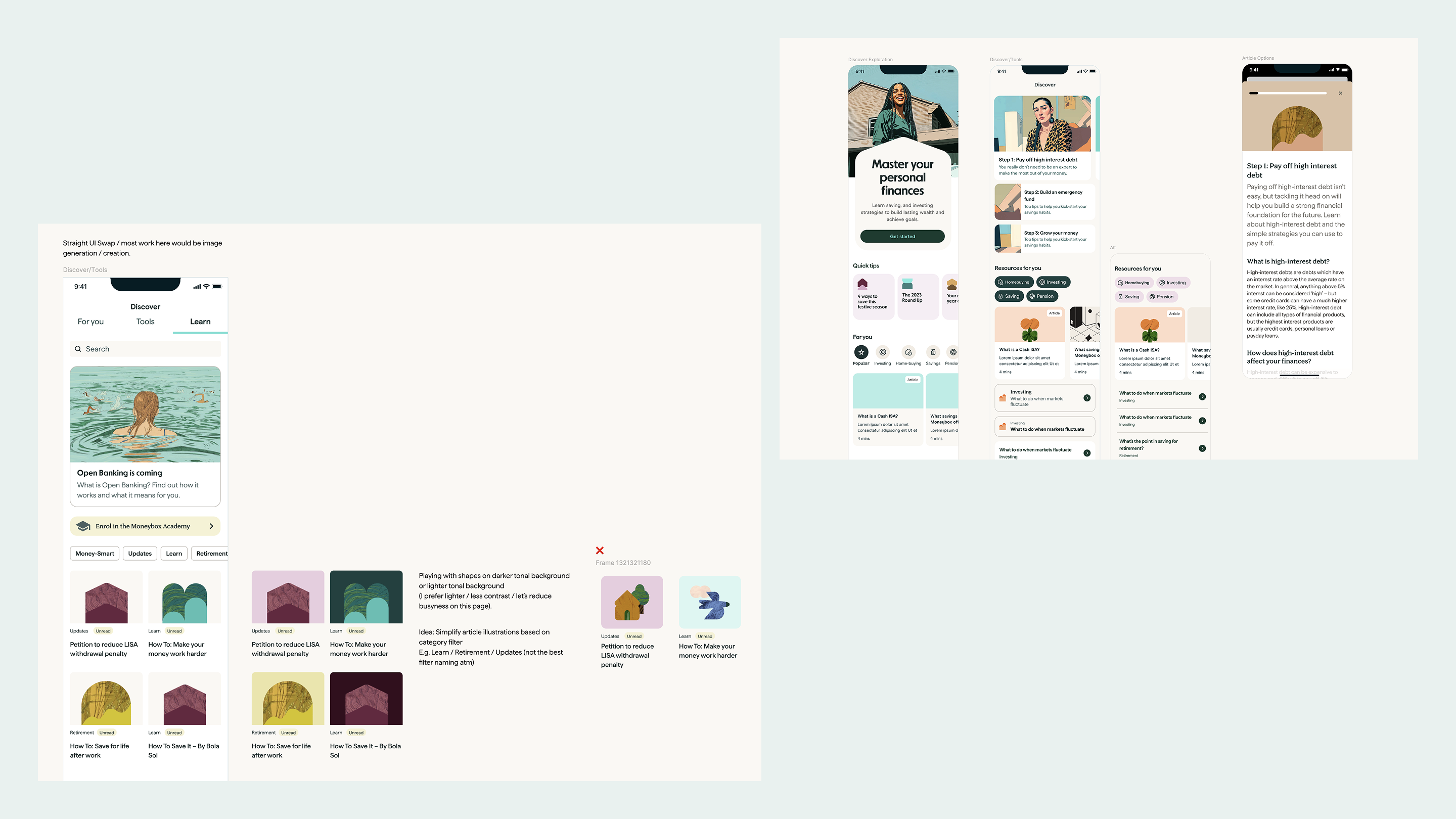
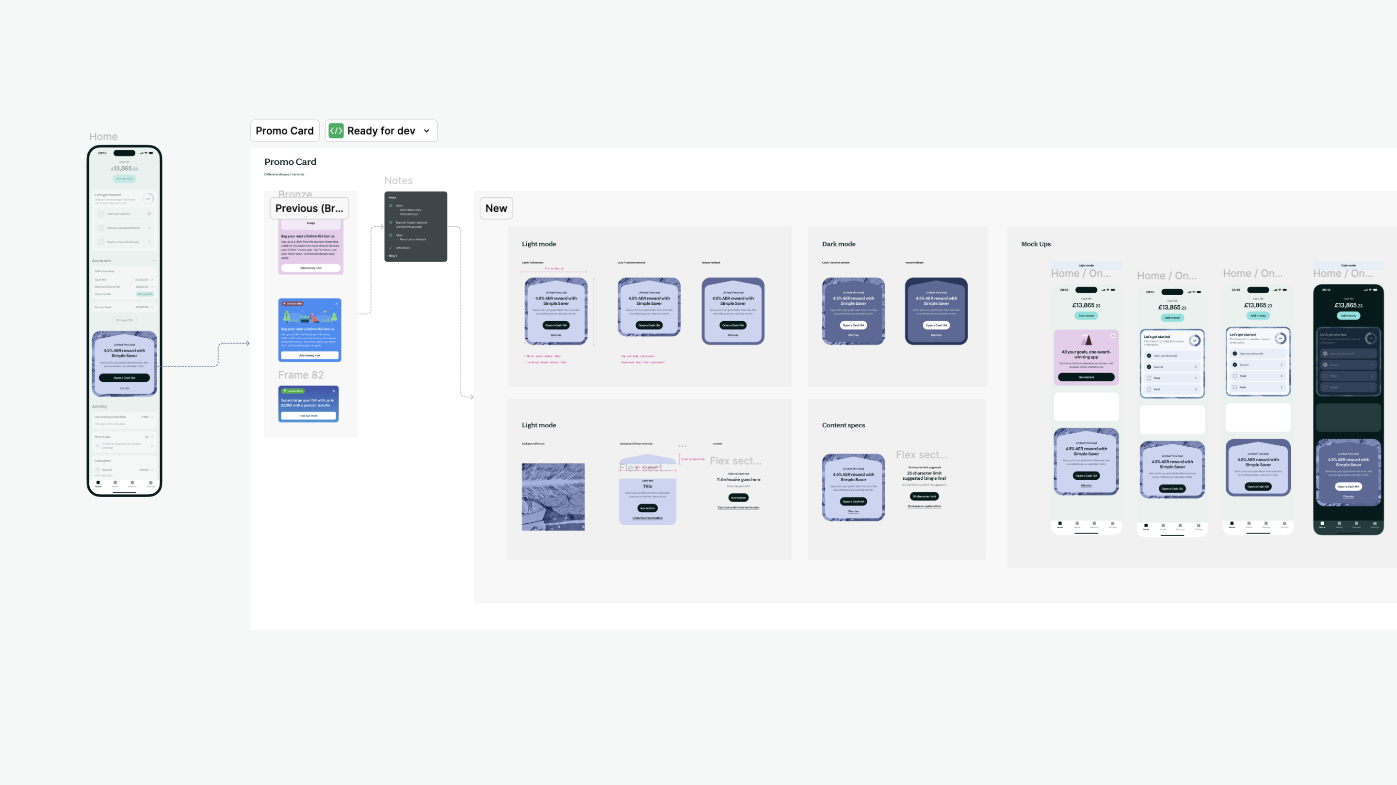
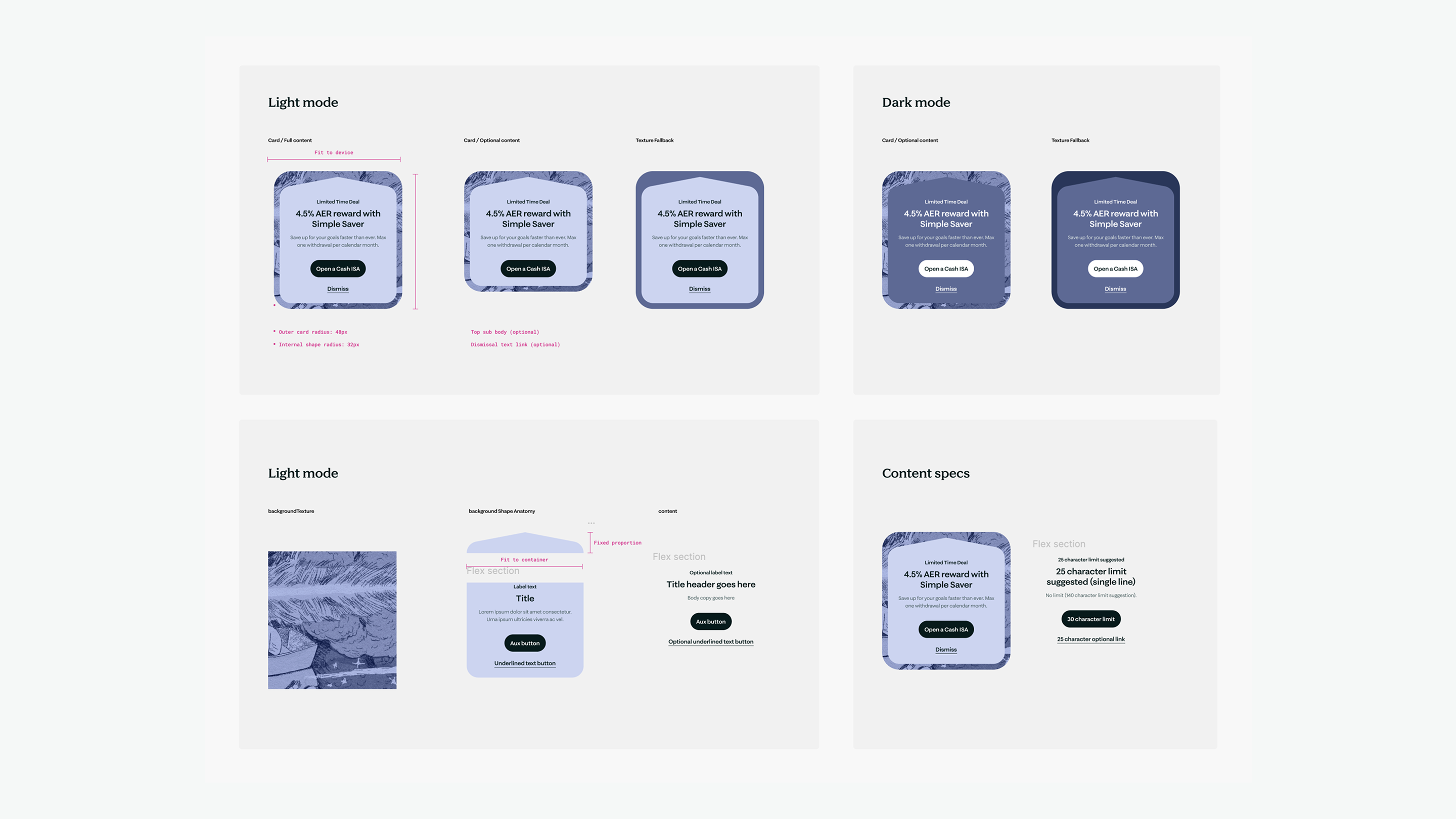
Reimagining blog article blocks, use of new illustration style, new vector shapes and how we may use these. Exploring the use of the shapes for UI, identifying colour pallette such as button colour, text colours, and other colour usage. Early exploration with the rough concepts allowed flexible creative play which needed to be paired with consolidated collaboration, aligned direction and agreed visual aesthetics.
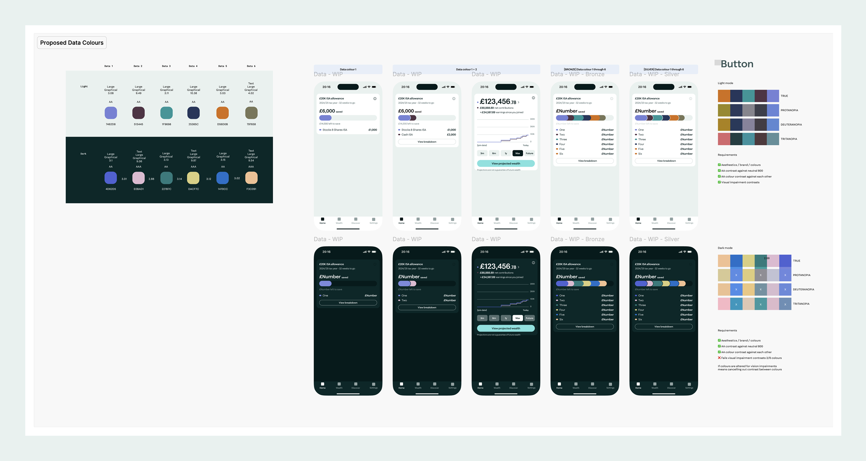
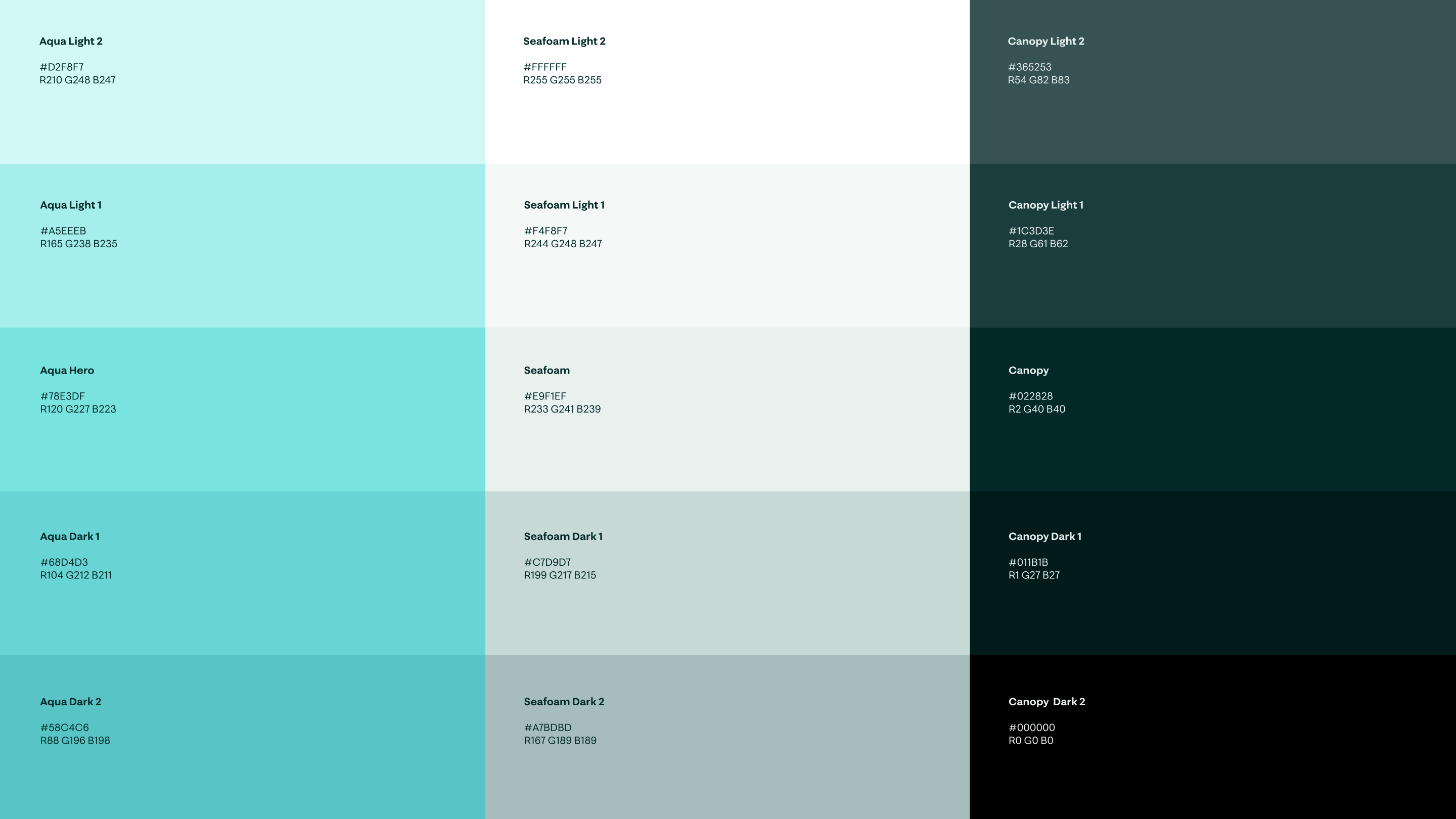
Deep analysis of data color combinations for dark mode ensured each color met WCAG AA accessibility standards against the background, worked harmoniously with other data colors, and had a corresponding light mode variant.
Styling progressively came together through collaborative design critiques and alignment sessions, ensuring visual designs elevated the UX and demonstrated the right usage of color. A later defined rule was to avoid colorful backgrounds to attain maturity and sophistication.
Designs were presented and reviewed often allowing the us as a tight-knit team to coherently understand the new brand guidelines taking shape.
As the visual identity took shape and each main component was progressively approved, comprehensive specifications were documented and delivered to native iOS and Android engineers.
Colour usage guidelines became clearer and evolved over the different app modules.

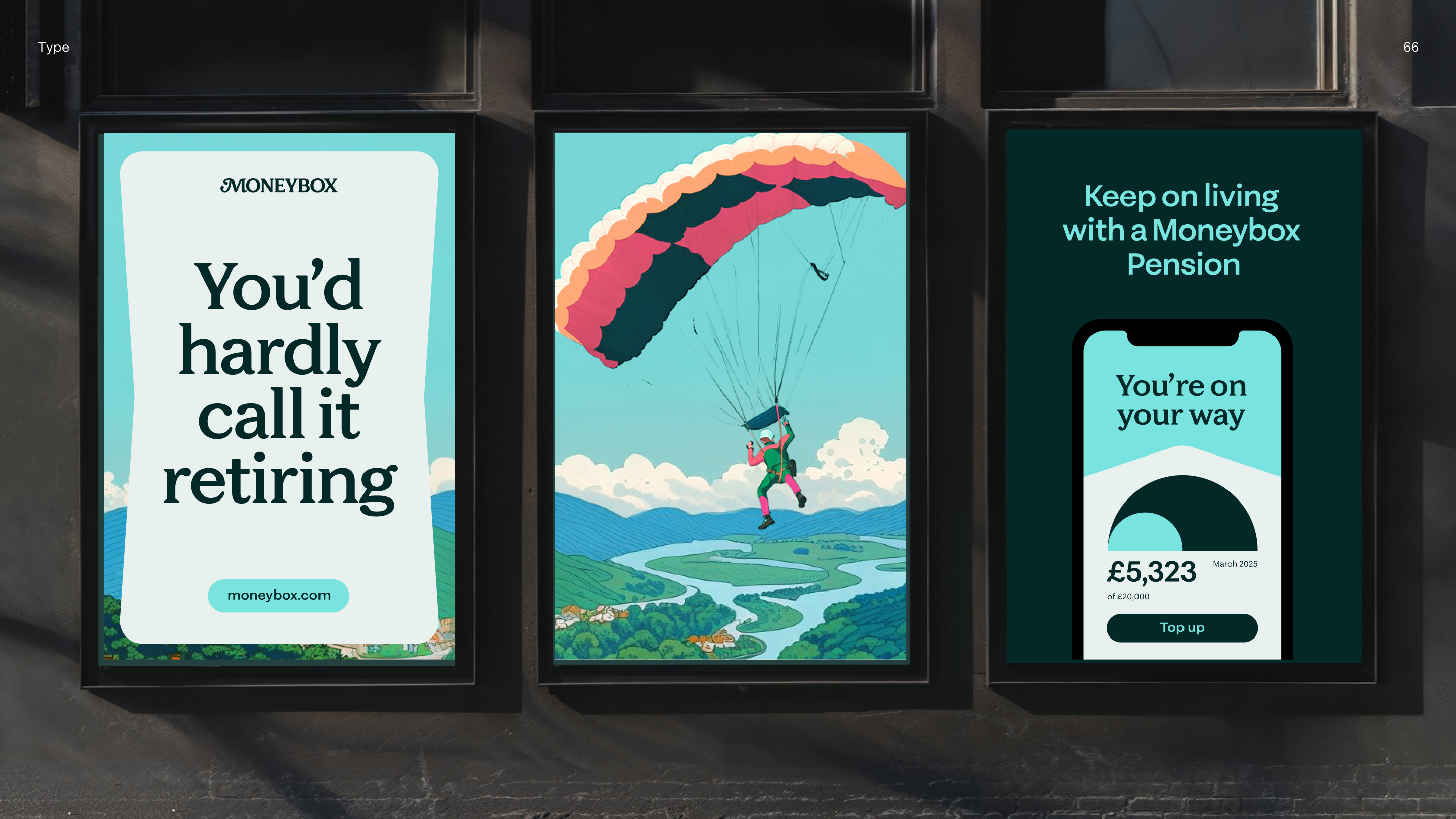
Visual identity look and feel
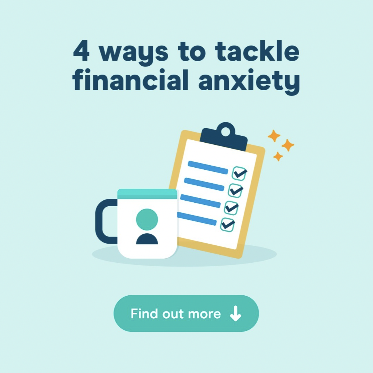
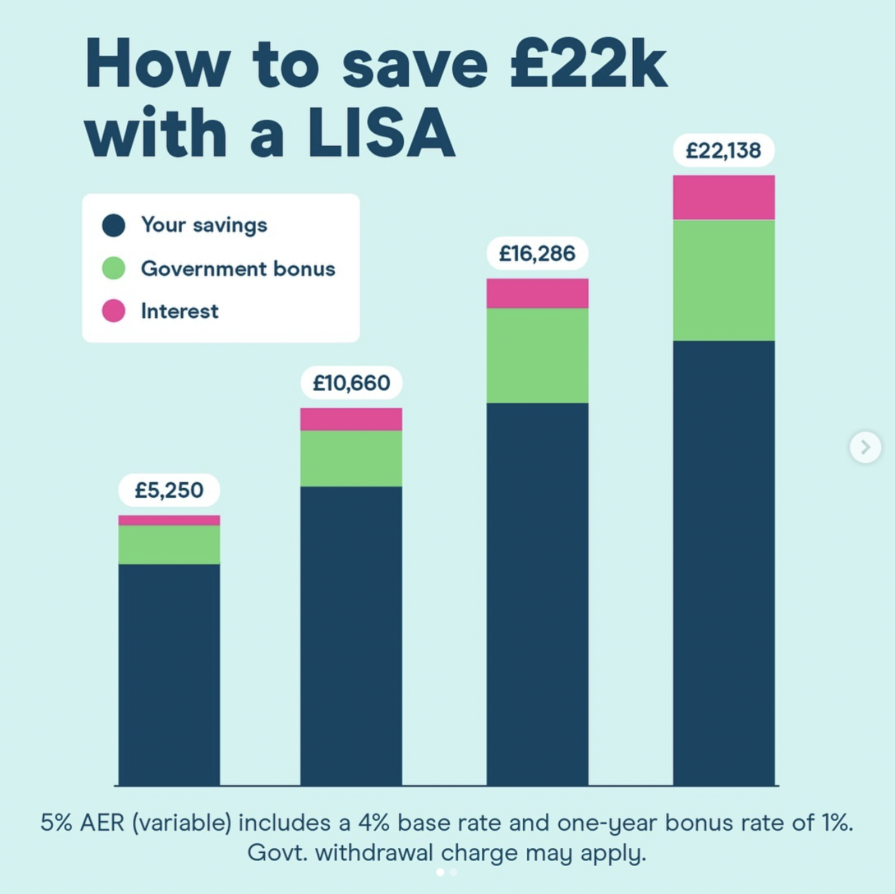
The new brand identity was applied live across the app, website and all online and offline channels cohesively.
The product, marketing, and engineering teams were efficiently briefed and followed all proposed designs and guidelines, culminating in the seamless and successful launch of the brand without encountering any technical issues.